Five Components of a Killer Landing Page
Landing pages are a crucial part of marketing. It’s not uncommon to have 5 to 50 different landing pages. But, what’s the secret sauce of a successful landing page? Let’s take a look at five unmistakable ingredients.
What if you could take your reader by the hand and lead them to join your newsletter, buy your service, register for your webinar, or download your product? Well, it turns out that you can — with the humble landing page.
The landing page is a crucial part of your inbound marketing strategy. It’s like having a personalized conversation with your audience. Instead of just sending your audience to your general home page and wishing upon a star that they’ll find what you’re selling, a landing page is a very specific sales presentation. A successful landing page explains exactly what you’re selling and how it benefits the audience.
And, by sales, it doesn’t necessarily mean money. Perhaps the intention behind your landing page is to build your email list. In that case, you’re “selling” your newsletter, and the audience is “paying for it” with their email address.
There are many different types of landing pages, but there are ten central components that will turn every landing page into a winner. Yes, ten. We’re talking about the first five today — and we’ll be talking about the next five soon. Remember that you can always turn to best ready-made themes in order to get the best out-of-the-box experience possible.
Interested to find out what they are? Let’s get started…
1. Visual Appeal
As a visitor, when I land on your page, I look at the big picture first. What pops out before anything else? Are the colors clashing (in a bad way)? Are there too many distracting elements vying for attention? Does this look legitimate?
You only have 10 seconds to hook your audience. That’s the length of time it takes for your audience to decide whether you’re a scam or not. So, assuming most people aren’t speed readers, the fastest way to communicate is with an appealing design.
Make sure your landing page looks clean, professional, and engaging. We’ll talk more about different elements that make your landing page shine, but overall, your website should be uncluttered and harmonious.
Choose two to three colors that represent your brand. Colors convey personality. Warmer colors (like reds, oranges, and yellows) are energetic and friendly. Cooler colors (like blues and greens) are calmer.
Whatever colors you choose, they should not distract from your central call-to-action. If you’re not sure what colors to choose, you can’t go wrong with neutral.
2. Navigation
There is no navigation on the landing page. Unlike other pages on your website, the only choice your landing page should offer is conversion or quit. You want to convert the reader into a buyer, subscriber, or user. If they do not want to do that, they can exit button left.
Research shows us that removing that pesky navigation bar can increase conversion by 100%. When you give people the opportunity to wander, they will. But, when you need to lead them down the funnel to your landing page call-to-action, you must remove distractions. Otherwise, I may be tempted to click on your “About” page to investigate you further, and then end up on a rabbit trail and never return to the landing page.
And, this bit may be controversial, but I recommend not even linking the logo to your home page. Nothing on your landing page should be clickable but the call-to-action, and the video (if you choose to add one).
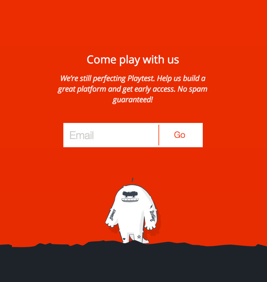
3. Logo
![]()
Have you ever been on one of those purgatory-like landing pages where you don’t know where you are, how you got there, who’s behind it, and how you’re going to get home?
That’s why the logo is an essential element to add to your landing page — your landing page is naked, otherwise! And no one trusts a naked website.
Although you don’t want people to be able to click the logo and leave the landing page, your logo needs to be there. It makes the landing page more credible.
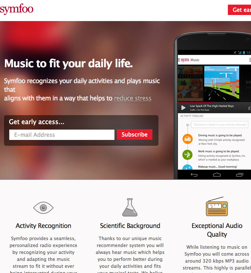
4. Videos
Having a video on your landing page can increase conversion by over 80%. Why? Because videos can be much more engaging than text. Most of us prefer to be visually entertained. That’s why images work so well in posts like this. Whenever your attention starts to drift, you’re brought back with a clever image.
However, on a landing page, when there’s not really a lot of text to begin with, having a plethora of images will muddy up the space. That’s why I recommend adding a video to support your claims, or educate the reader on what to expect from your product or service. Increased clarity is the main benefit of video on your landing page.
5. Copy
Landing pages can’t just rely on videos. You need killer copy on your landing page. Not everyone will be able to watch a video, but everyone will be able to read your text.
Remember that copy is not content. The purpose of every word on your landing page is to sell whatever is your call-to-action.
Identify who your ideal reader is, and speak directly to that person. Understand what their problem is (they want to know how to edit videos, they want to win back their ex, they want to learn French, etc…) and then position your product or service as the solution.
Bonus Tip
If you have more than one offer, make more than one landing page. Don’t try to cram all of your offers on one landing page. It just confuses the reader, and results in less sales.
Research shows that companies with over 40 landing pages have 12 times more leads than companies with only 5 landing pages or less. You may not have 40 different products or services, but you may have 40 different types of readers that you’re appealing to. Make sure your landing page is tailored to that audience.
In Closing
A landing page is nothing to fear. Incorporate the aboveelements and you’ll have a winning formula each time.
ABOUT THE AUTHOR
Jacqueline is an award winning writer. You can findher website, and follow her updates on Twitter.