Tremendous Web Usability Tips for Your Website – Bolster Your Chances at Business Success
A Look at Some Surprising Usability Statistics
- 60% of the time, people fail to find the information they seek.
- 50% of sales transactions are hindered because users cannot find the desired information and 40% of these users don’t return to a website when their first experience is negative.
- Too much irrelevant information force 62% of online shoppers to give up looking for a specific product or service online.
- Websites with the highest sales are found to be usable only 42% of the time.
These statistics can help anyone comprehend the influence of website usability. Whether you are trying to sell a service, a product, or making efforts to build a potential client base, your website should be structured such that you never lose focus of the way it communicates with prospects and customers.
 Usability is a broad term when used in the context of websites. The Internet is the exclusive platform used by most of the businesses today and it is the ‘usability’ or ‘ease-of-use’ offered by a website that can decide the fate of a business, swinging on the pendulum between failure and success.
Before progressing to the part where ways a website owner can improve the usability of a website are specified, it is important to dig deeper into the concept. A website, being a collection of web pages, is navigated by users to find information regarding services or products they are looking for.
Website usability, therefore, can be defined as the efficiency, effectiveness and satisfaction with which visitors find the desired information, ensuring an improved user experience.
Website Usability: Why Should You Make Efforts to Improve it?
A handful of reasons as to why you should seriously consider improving your website’s usability is briefly listed below.
- It helps to achieve a good understanding of a good user experience.
- It allows visitors to effectively find their way through complex website architecture.
- It assists in driving more conversions.
- It aids you to communicate your ideas successfully.
- It ensures that users are not lost when browsing the website.
- It ascertains that the website framework does not hinder user experience.
- It improves the way your site functions.
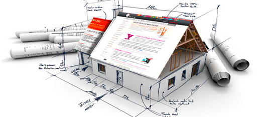
Website Usability Checklist – Revealing Secrets to Happy and Satisfied Users
There are certain rules that have to be kept in mind when structuring a website and the following account lists all the essential aspects that have to be taken into consideration.
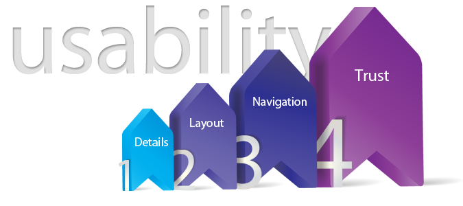
Paying Attention to Details

- If a webpage is taking more than ten seconds to download, it may annoy users. Make sure all the pages on your website download within the 10-second time slot.
- If your website has been designed in such a way that the user will be spending a considerable amount of time viewing the illustrations or graphics, trim them and make sure they are aesthetically appealing.
- Any pop-up screens, flash or splash movies should have a ‘close’ button.
- Avoid playing music automatically.
- Stay away from frames as they make navigation nearly impossible.
- Use the same layout for all the pages on your website as this is what users expect.
- Layout of the page should be optimized for a length of 1000-1600 pixels and width of about 770 pixels.
- If the page will scroll down, make sure you use a liquid layout so that it resizes efficiently.
- Place your logo at the top of the left-hand corner of the page.
- The search bar should be placed at the top of left or right-hand corner of your homepage along with a button clearly labeled ‘search.’
- Offer search only for your website and not the Internet.
- Incorporate a ‘help’ section only when your website is too complex; it should be placed on the top of the right-hand corner.
- Use icons that instantly make visitors realize their purpose and refrain from inventing your own.
- Do not try to be creative when naming the different navigation areas as it will only frustrate the user. It is a good idea to stick to conventional terms like Contact us, About us, Home, Careers, etc.
Layout of Web Pages
- Use the same layout for all the pages on your website as this is what users expect.
- Layout of the page should be optimized for a length of 1000-1600 pixels and width of about 770 pixels.
- If the page will scroll down, make sure you use a liquid layout so that it resizes efficiently.
- Place your logo at the top of the left-hand corner of the page.
- The search bar should be placed at the top of left or right-hand corner of your homepage along with a button clearly labeled ‘search.’
- Offer search only for your website and not the Internet.
- Incorporate a ‘help’ section only when your website is too complex; it should be placed on the top of the right-hand corner.
- Use icons that instantly make visitors realize their purpose and refrain from inventing your own.
- Do not try to be creative when naming the different navigation areas as it will only frustrate the user. It is a good idea to stick to conventional terms like Contact us, About us, Home, Careers, etc.
Navigation
If you are wondering whether or not your website is effective in terms of navigation, you should be able to answer question like:
- Where am I?
- Where can I go?
- What is here?
- Where I have been?
If you are having difficulty answering these questions, it is time you revamp the navigation of your website. Navigation is provided from the home page to all the other pages on the website; there are four ways to do it.
- Using categories displayed at the center of the page
- Using a left-hand rail
- Links placed across top of the page
- Tabs used at the top
The last three are best. While categories are also displayed at the center of the page, it wastes a lot of space. Also, it is recommended that you have similar elements grouped together in the menu. Avoid providing navigation to different sections of the same page. If you feel that a page is too long, you can simply divide it into several pages. You can make use of navigation links placed at the footer in case you do not want to go with the approach of having multiple pages and if you will be scrolling down long pages. Also, it should be kept in mind that a webpage should not have more than 7 text links. A sitemap will be useful but instead of using an image, use a plain page providing links to all the other pages on a website.
Build Trust
Trust is essential if you want the customer to keep coming back to you for the specific product or service. This is also important because if you do not inspire confidence, no one will want to work with you.
- You are obliged to let your users know about any information you have collected about them.
- You are required to list your name and address on the website.
- Have a privacy policy page clearly stating that any user-related information collected will not be abused by any means or disclosed to third parties.
- An ‘About us’ section will help as it will give the users idea that the company is for real.
Bottom-line, by developing a website conforming to the rules listed above, you can easily secure higher user engagement delivering a pleasant experience for anyone and everyone. Last but not the least, keep your website simple and wait for things to unfold in your favor.
About the Author:
 Roman Viliavin is the vice CEO at Promodo SEM Company. Unconventional Thinker and candidate master of chess. Roman has been working in the field of search engine optimization since 2005 and is the moving spirit of the company. Participant and speaker of all major events in SEO business. Roman has successfully completed dozens of projects and gladly shares his experience with SEO community via articles and various online and offline publications. Follow Roman on Twitter and Facebook.