Site Renovators Part #3 – Conversion Rate Optimization
This is part three in a series of posts dedicated to the Midphase Site Renovators contest in which one person won a website makeover from the group of marketing and design professionals at Midphase.
As part three in our Site Renovators project we are going to review Hermann Communications to see how we can improve the overall site performance from a conversion perspective.
Some may think a conversion is only when an actual purchase is made, however we are looking at a conversion as any action we want a user to take that adds value to the business. This could be anything from subscribing to a newsletter, filling out a contact form, or, yes, purchasing a product.
The first step to outlining these conversion goals is to understand why the site exists. What is it that the site needs to accomplish for us or our business? In the case of Hermann Communications the main goal of the website is to get customer leads. This gives us two very specific actions we want the user to take:
- Fill out the contact form.
- Pick up the phone and call.
Now that we know what actions we want the users to take, we can start looking at the site to see if we are presenting these items in a way that will get the users to follow through with these actions. For us to effectively do this we must give the user three things:
- Tell the user why they should do it (what’s in it for them).
- Give them a clear call-to-action (fill out the contact form or call).
- Give them the confidence to complete the action (create trust and credibility).
These three things are the foundation of getting better conversions and unfortunately where many sites fail to deliver. Now let’s take a look at hermanncomm.com and see if there is anything we can do to improve their conversion process.
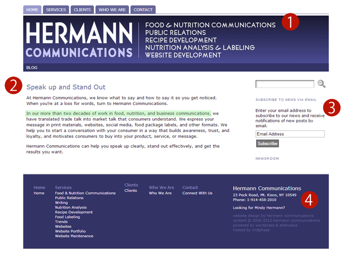
- The job of the main header of the page should be to gain the users attention, begin a conversation with the user, and entice them to read the rest of the copy. In our opinion, there is some missed opportunities on hermanncomm.com by leaving it to a list of services. We suggest changing this to a statement about the unique value they offer to those looking for their services; something that we’d suggest to anyone else.
- The main copy also speaks a lot about “what” the company does but doesn’t really provide a compelling reason as to “why” I should bring my business here.
Once we get a user into the main content area of the page we want to lead them to where we want them to go. If they need to go back to the main navigation we don’t have a clear path and they are lost. HermannComm.com doesn’t give me anywhere to go or something to do if I happen to read all of the copy. At that point I am forced to go back to the main navigation or just click the “back” button.
The best piece of content in the copy highlights the 20 years of experience in their area of expertise; unfortunately it gets lost in the copy. This should be called out much more, along with some customer testimonials or other things that would bring credibility to the company. Remember, we not only need to give reasons “why” but also the confidence to complete the action; done by creating trust and credibility. - There really isn’t a main call-to-action on this page but the closest thing would be the subscribe button on the right. Getting users to subscribe to your blog is a good idea but in this case is a secondary conversion goal and shouldn’t take the place of a main call-to-action. Adding a clear call-to-action would really help give the user a clear path of what to do next.
- One of the goals is to get potential customers to call regarding new work. If that is the case why hide the phone number in the footer? Pulling this up higher on the page and making it more evident as a call-to-action could help get users calling in.
As you can see by just clearly defining the site goals and looking at a page through the eyes of your users you can come up with some simple site changes that can make a huge difference in the performance of your site.
In our final post we will put together a redesign of the homepage implementing these recommendations. Obviously there are many things that can be done to improve page performance, if you have any good recommendations or thoughts on this page feel free to leave them in the comments below.