Top 5 Professional Mobile Responsive WordPress Themes
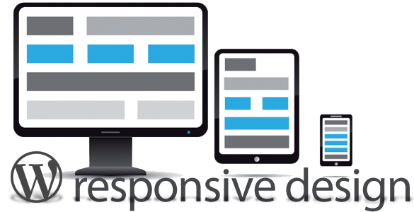
Mobile responsive design makes it easier for users to browse through web pages using their mobile devices and tablets. That’s why many WordPress sites deploy premium designs optimized for smartphones. It may cost a wee bit more cash, but in return users get more features and arguably a more robust, secure browsing experience
A responsive web design is built using W3C and CSS3 media queries that allow a website to deploy its content and graphics across various OS platforms and screen resolutions.
- Modulo
- Flex Slider – 100% flexible; can display images and videos
- Carousel slider – display images and videos
- Nivo slider – displays only images but offers many effective image transitions
- Streamline
- Super Skeleton
- 20 bonus HTML template files (showcasing the flexibility of the framework)
- The Super Skeleton UI Kit (Exclusive Freebie PSD)
- 3 Minimal skins and 2 fontstacks to start with (adding 100+ skins is really silly if you ask me)
- Fully internationalized and ready for translation features!
- Individual skinnable PSD files for all major UI elements
- Clean
- Reveal
If you’re looking for a clean, functional, and flexible slider for a portfolio website, ThemeForest’s Modulo theme can display images, videos, and content on mobile devices. This premium responsive theme comes in three sliders:
Web designers can choose between Carousel and Nivo sliders as alternatives, though they cannot be made flexible on mobile devices. Modulo offers unlimited color variations, short codes, and Google fonts, which are perfect for your profit-generating website.
Modulo currently costs $40 for a regular license.
StudioPress’ Streamline responsive theme is an outstanding solution for a news- or business-style WordPress site. It is available in three different colors, namely, orange, green, and blue, and features three layout options.
In order to maximize the features, users are required to buy the Genesis Framework to deploy the Streamline child theme, which costs $79.95.
Super Skeleton is a professional responsive mobile design that comes with the WordPress theme along with the straight HTML template. It works best on any screen with its comprehensive HTML5 framework and includes a full template system. Its touch gestures works on sliders, too.
Super Skeleton includes:
Super Skeleton currently costs $45 for a regular license.
Another stellar responsive theme is Clean that is designed for any screen resolution and is built with Twitter and Flickr integration. Mobile browsers enjoy its smooth touch gestures, featuring its touch swipe slideshow for easy navigation whether on smartphone or tablet.
The developer also offers discounts for the Clean responsive theme. Buy 1 theme and get 1 for free for only $49.
Reveal is a perfect responsive theme for web designers and photographers to display their portfolio. Reveal is a highly visual theme that features post thumbnails, built-in light box, threaded comments, and Twitter and Flickr integrations for sharing. This minimal theme and clean styling along with Ajax-powered project viewing should make your website a hit with users.