Google Crowns Mobile As King
It’s happened! Google has declared ‘mobilegeddon’, or at least that’s what some are calling it. Mobile sites are to be favored in search engine optimization (SEO). Are you one of them?
Keeping up with the latest Google algorithm can be a full time job. Considering all of the Pandas, Penguins and Hummingbirds, it’s a lot to keep track of. The easiest way that we’ve found is to read with Google’s Webmaster Central Blog where you will read helpful posts like this one.
Sometime in February, Google announced their plans to optimize search results in favor of mobile-friendly sites, claiming “users should get the most relevant and timely results, no matter in the information lives on mobile-friendly web pages or apps.”. This is great when you’re trying to find a great place for takeout or the phone number to a towing company, but not so much when it is your site that will be left in the dust.
Beginning April 21st, Google will roll out changes that will cause your site to drop or rise in rankings depending on how mobile friendly you are considered to be. If you’re not sure how your site will fare, try the Mobile-Friendly Test. The good news is that Midphase clients have a competitive edge on going mobile thanks to our website builder. Our latest version, V7, will automatically optimize your site without any extra coding or hassle along with all of the great website builder features we love like hundreds of templates, easy drag-and-drop design and affordability.
For more information on our website builder visit: Midphase.com/website-builder/
According to Search Engine Land, the roll-out will take up to a week to fully take effect. Google also claims that there are no degrees of mobile friendliness: either you work for mobile or you don’t . In a Q&A with Google team members (see below), they advised site owners to beware of small font sizes, tap links being too close together and content that isn’t readable from different screens. These seemingly small features can deem you ‘not mobile friendly’.
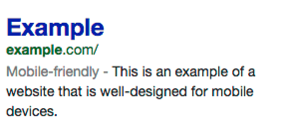
“Take out your phone, look up your website. See if there is a gray mobile friendly label in your description snippet. If it is in the search results, if you see it, that means that Google understands that your site is mobile friendly and if you don’t see it then we don’t see that your site is mobile friendly or your [site] is not mobile friendly.” -Mary from Google’s Webmaster Relations Team.
If you aren’t quite ready for the latest Google change, don’t fret: you’re not alone. According to Business Insider quite a few of the world’s biggest brands might take a hit in SEO for not being mobile friendly. We can be sure that development teams are scrambling to get ready for the switch including Nintendo, the European Union, Dyson and American Apparel, to name but a few.
Contact our 24×7 tech support team to learn more about getting your site ready for Google’s latest algorithm changes.
Cover image accredited to Pika/Shutterstock.com